Ezlo Innovation
0—1 Design
Smart Home
IoT
Startup
Design System
iOS
Android
Mobile
Hardware
Charts

Context
Energy Monitoring was a new feature I designed for “Ezlo Innovation” consumer smart home mobile app, giving users visibility into what their connected devices were actually costing them to run, so they could cut that cost.
Senior Product Designer
Team of 10 People
1 Month
No Clear Requirements
Limited Resources
New Product Domain
Research Insights
Together with Product team I had been running regular feedback loops on the existing product and market and user research of our competitors. I did research data synthesis to get a clear picture of what we were building and why agreed across every team.
❝
No live data, usually 1 to 2 days old as data needs to come from the provider meter.
❝
Consistently misses blocks of data.
❝
Estimated bill is always much larger then the real cost.
65% of users distrusted the estimated data and wanted to see real consumption per device.
Where market leaders fell short
🚫
Users distrust the consumption data.
🚫
Bills are estimated incorrectly.
🚫
Live views show stale information.
🚫
No device consumption data management.
🚫
Lack of smart home automation features.
🚫
Useful features seat behind paywalls.
Where we can stand out
✅
Live consumption data with no limits.
✅
Smart home device energy management.
✅
Personalised energy goals.
✅
Most accurate data disaggregation on the market.
✅
Control home appliance consumption.
✅
Time and event based device control.
❝
I always forget to turn something off before I leave.
❝
I want to set a limit to how much electricity I want to spend this month.
❝
Due to lack of device control features will not be worth using it in nearest future.
80% of users were willing to switch to a product that allows them to control their appliances.
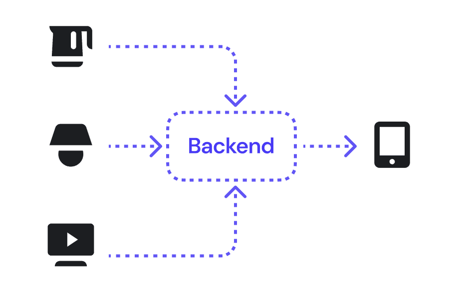
Defining our technical constraints
Data reporting frequency varied widely between devices. Some devices reported every few milliseconds. Others reported every ten seconds. Some only sent data when they crossed a threshold. This became a core constraint that shaped the data visualisation decision in the product.
Who are we building this for
Market and user research data was synthesised into an empathy map and helped me define two personas that matched the company's expansion goals.
🏠
Current smart home user with a big family and high usage of appliances.
Family members leaving appliances on causes friction at home. Tracks consumption by hand. Wants remote control over devices, alerts when something spikes, and period comparisons to plan the monthly budget.
🧗♀️
Urban dweller who is single and tech-savvy, active traveler and never used smart home.
Has no idea what the energy bill numbers mean and keeps leaving devices on without noticing. Wants a monthly consumption view, alerts when something's using more than expected to cut waste.
Hypothesis, Scope,
Aligning Teams Together
At the beginning the hardest problem was team alignment. Leadership needed to agree on one direction, and every team needed an approved roadmap and scope to work from.
1
Validating scope via Job Stories
I translated each persona's needs into specific job stories. Each story described a moment in which the user would need the feature and what outcome they were trying to reach. Together with the PDM team I approved the hypothesis that aligned with business goals.

2
Building information architecture
I created the full feature functionality map in a joint session with the development team. They flagged technical blockers before any wireframe existed. That prevented expensive rework later.

3
Defining edge cases
We had a lot of talks with the backend developers where I have created a schemes that show the connection between front and backend side for the main user scenarios, including negative cases where we need to let users know why they see the error and how to solve it.

4
Agreeing MVP and Phases
MVP scope was agreed jointly with the PDM team, stakeholders, and engineering. We defined Phase 1 as the minimum that was genuinely competitive and buildable on time. Everything else was tagged Phase 2 or dropped.

Iterating with Raw Concepts
First I built interactive prototypes to quickly test and validate design hypothesis. As we were moving very fast I have to focus on validating decisions with stakeholders, product and engineering teams first and conducting small user testing on the go. The full scale user testing was agreed to start during the beta release.

1
First iterations
✅
Live data shown with 10 second increments and shows changes almost instantly.
✅
Previous live data is available but in 10 minute increments.
✅
Breakdown by device shows which one consumes the most.
✅
Average consumption number and comparison to a previous period help control the costs.
✅
Date selection lets users explore previous periods.
✅
Quick switching between periods gives a different perspective on consumption.
✅
Filtering by device keeps the chart and totals focused on what users care about.
🚫
Filtering right from the device list sometimes caused misclicks, opening a filter instead of the device screen.
🚫
The goals section appeared to be less important than the device breakdown, so we need to move below it.
🚫
Due to backend limitations, live consumption can only be shown when the app is open.
🚫
Year view was scoped out due to backend limitations and lower priority for users.
🚫
Scoping group implementation pushed engineering past schedule, so we moved it to phase 2.

2
Validated iteration
✅
Live, day, week and month were kept the most requested periods.
✅
Average consumption and comparison to a previous period help control costs at any point.
✅
Breakdown now shows total consumption for all devices, keeping context without scrolling up to the chart.
✅
Removing filtering checkboxes from the device list in breakdown avoids miss-clicks that triggered the wrong action.
✅
Filter now opens in a dialog, so users pick the device and confirm in a dedicated view.
✅
The goal list moved below the breakdown, keeping all goals on one screen with no separate view needed.
✅
Users can now create goals right from the dashboard, removing unnecessary steps.
✅
Filtering by device keeps the chart and totals focused on what users care about.
50+
different iterations were made to validate the right direction before creating the final designs.
100+
Screens and states were tested with users and cross-functional teams.
100%
of design were aligned with users needs, development, product and business.
Delivering the Final Design
After testing and agreeing on all user interactions and UI behaviour, I moved to finalising flows using the design system components my team and I had previously created. At this point, backend and firmware teams were already working on previously agreed functionality, fully aligned with our design decisions.
Onboarding without disrupting the existing flow
✅
Needed to reach both new users and existing users who'd already connected devices.
✅
Built two distinct entry points so neither group had to search for it.
✅
New users set it up as part of getting started.
✅
Existing users find it in their device settings.
✅
Zero friction at the point of discovery.
Goal tracking feature to work from day one
✅
Goal tracking mechanism shows progress with even a few seconds of history.
✅
When goal limit is reached you get a notification to act instantly.
✅
You can track all your energy goals in one place.
Live Energy Tracking
✅
10 second increments live data covering different reporting device frequency.
✅
Average consumption number and comparison to a previous period help control the energy expenses on the go.
✅
Quick switching between different periods gives different perspective on consumption.
✅
Live data is available in 10 minute increments to keep deep history with less cost on cloud storage.
✅
Breakdown by device lets users see which device consumes the most.
Negative case: maximum of tracking devices limit
✅
Clearly addressed the firmware limitations on how many devices can be tracked.
✅
On time error notification prevent usage disapointment before users even start the device onboarding.
✅
Guided flow through the process of how to fix the limitation issue.


Preparing a Smooth Development Handoff
Chart behaviour, rounding rules, period comparison formulas, and arrow direction definitions were all documented before a single screen went to build. Getting the maths agreed upfront meant the build matched the design intent.

Energy monitoring dashboard
1
2
3
New components added to the design system
Together with the frontend team I discussed and agreed on every new component. I document all the sates, behavioral rules, properties, different use cases and patterns

Impact
The feature launched to an existing user base that had been waiting for it. It also opened the product to a new segment the company had not been able to reach before. The release was followed by a marketing campaign that drove new hardware sales.
On time
shipment of critical feature allowed company to successfully close a deal with a major energy provider.
Trust
earned trust from leadership by shipping critical work under time and resource pressure while keeping teams aligned.
10,000+
new users acquired at first month after energy monitoring was launched.
Reflections
We always should love the problem — not the solution
There is always a temptation to build the best ever solution, but under time and resource pressure the only way is to find a balance between best and feasible.
Limited resources and time doesn't mean to skip important steps
Even though we had no time and budget to run dedicated user interviews, conducting a small number of sessions sharpened our decisions significantly.
Cross-functional team alignment
Engineering, backend, hardware, and firmware teams each had their own constraints. Leadership needed a strategic view. Without a shared vision the same conversations would repeat across every meeting.
Be ready to say "No"
Every time someone comes with the better idea or a new concept you need to validate it against business goals, technical constraints to keep the scope at feasible level.